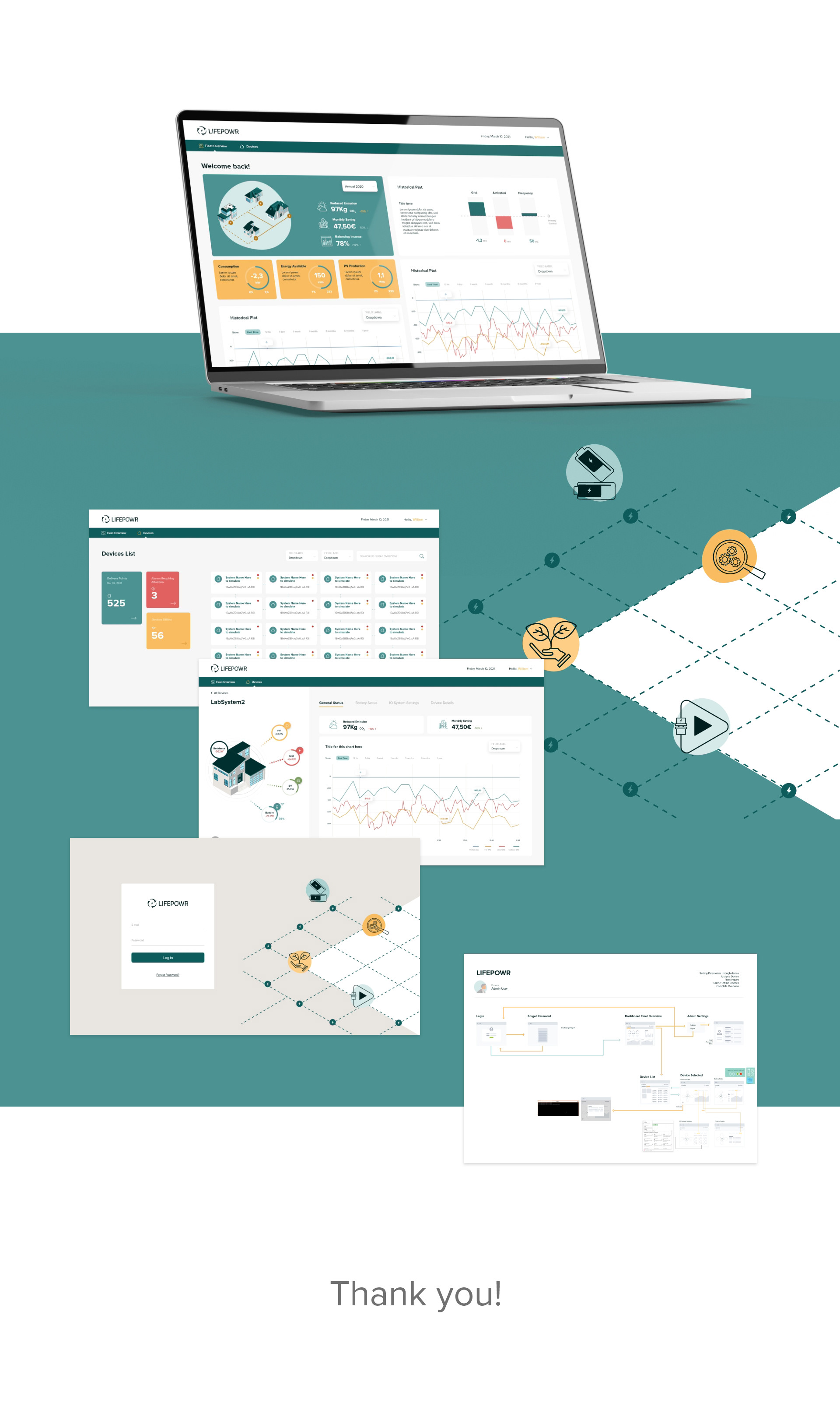
Overview
LifePOWR needed a redesigned energy-management dashboard that could deliver real-time insights, support cost optimization, and scale across multiple user profiles—from homeowners to energy specialists.
My Role
Lead UX/UI Designer — responsible for information architecture, data-visualization design, and UI system improvements.
The Challenge
Users felt overwhelmed by fragmented data and struggled to understand consumption patterns or make informed energy decisions.
The Solution
I redesigned the dashboard to focus on clarity, hierarchy, and actionable insights. The new interface consolidates the most critical metrics, simplifies the interaction model, and makes system performance intuitive at a glance.
Key contributions:
Built a clear information architecture for real-time data.
Designed visualizations with a strong sense of hierarchy.
Simplified flows for monitoring, alerts, and device control.
Defined UI components for future scalability.
Result
Faster user decision-making due to simplified navigation.
Improved data comprehension with refined visual structures.
A scalable design foundation that the engineering team adopted.